
We asked Rob Alderson to have a chat with Kate about magazine covers and features she’s created over the years, and which ones have particularly stood out for her…
RA. The print landscape is obviously changing; has that changed the kinds of commissions you get?
KM. In about 2006/7 I found there was a mini resurgence of print and it was less precious, half way between a fanzine and a magazine. Because of rave culture and indie music and this sort of pulse that went through London at that time, there were more formats for people to interact with. It was an amazing time to be a creative. Now it’s dropped off a bit and although there are lots of magazines, they are maybe a bit more sophisticated, a bit less rough around the edges.
RA. Do covers have to work harder nowadays?
KM. There are real trends in cover design and it drifts between illustration and photography quite regularly. I feel like right now illustration is about to pick up again but for a long period of time, for like the last five years, photography has been the thing. I enjoy illustrated magazine covers and I think there is a real place for them.
Sometimes you want to blend in in the magazine world and sometimes you don’t and I have had the pleasure of doing a couple of covers that didn’t blend in.
RA. You have said before that you get your best creative ideas while on the phone to the client – is that the same with your editorial work?
KM. Yeah, because that’s often the only real time when you get to collaborate with the client. I get like a chemical rush. If you put me in an MRI and did an assessment of my brain, I think I would get that serotonin boost, or whatever it is you get infused with in those sorts of situations.
I only have certain skills I can pull from my palette as a creative. I try and pull the right skill and the right style out for that theme. Sometimes it’s about combining them, sometimes it’s about pushing the client in a slightly different direction to what they had originally expected.
Occasionally I will change my mind, but most of the time what I start with is what I continue with. The thing with editorial is the turnover time. With most commissions you have a week minimum, up to three weeks maybe, but with The Guardian Guide, for example, the commission comes on a Friday night and it has to be in on the Monday morning. Over that weekend you might get to call the art director once.
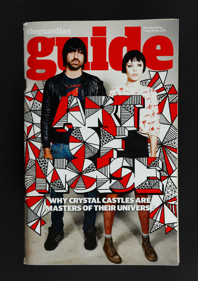
RA. Talking of The Guide, that’s one of the commissions you have picked out as a favourite.
KM. This is my favourite cover of all time, The Guardian Guide A-Z of Modern Pop Music. I love music and I love working in music. There are no annoying sentences when you are doing lettering; they are just individual phrases. All of them are a symbol for something so I can design the type to represent that music. It’s all very basic, what a five-year-old would do but on a slightly higher level. There were no changes and I managed to sneak some nipples in too. It was really fun and I feel like a lot of people took notice of it.
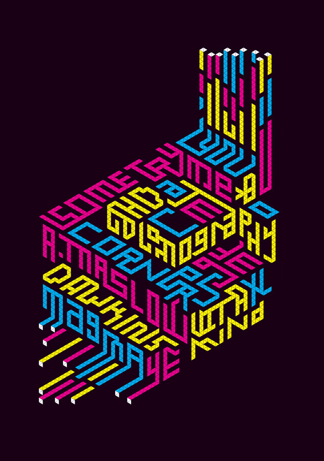
RA. The next one you’ve got is a spread for Wired…
KM. This one was about internet talent. I think originally what I put forward was completely different – very wobbly and weird – but after a while we ended up going down this more isometric route and it worked really well. This is basically what Google looks like nowadays, now I think about it.
I have done a few pieces for them and sometimes it’s just a single page graphic with no relation to anything else. We did one for the first of the first 2011, so 01.01.11. We did a palindromic illustration that was just the opening page, as a marker of the funny date (laughs). Quite a strange choice.
RA. What’s the next one you’ve picked out?
KM. This is a really important one. I was still a student and I emailed Steve the editor about being in Super Super magazine which is a pretty lame-slash-brazen thing to do.
I used to be a total arsehole. After I finished university I left the country and moved to America because I realised I had turned into a total dick. I was a club kid, a scene kid. I was on the guest list, I knew everybody. I chose not to be that person any more because I realised that person was gross.
RA. But as that person you sent this email…
KM. Yeah, being that person did help me in my career. I am a lot less that person now than ever before, but I emailed him and said, ‘You should let me paint a mural and photograph me jumping up and down in front of it.’ He said I could do a pull-out poster in the magazine. I was really obsessed with popular science and anthropology.
RA. Wait, you were a scenester who was really into anthropology?
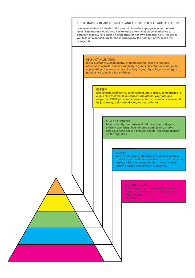
KM. I just really liked pop science, pop economics. I didn’t really enjoy reading about design, I enjoyed reading about people and the behaviour of people. I was really interested in Adrian Maslow’s hierarchy of needs, so I made this isometric poster, and then on the other side Steve asked if I could do a self-portrait so I made my own hierarchy of needs…
RA. I love the fact that stationery and sex are in the same section.
KM. The top one – self actualisation where obviously everyone is trying to get to – says “Morals, creativity, problem-solving, lack of prejudice, acceptance of facts, honesty, modesty, a good concentration span, an appreciation of science, economics, languages, physiology, sociology, a good pencil case and a hot girlfriend.”
RA. It’s like performance poetry when you read them out loud.
KM. I was such an arsehole. This is a self-portrait of me in 2007.
RA. But how interesting that you have that…
KM. And it’s in a magazine. It is a time capsule. Maybe I shouldn’t have picked this one. (Laughs)
There are so many bits and pieces. This one is for The Royal Mail magazine. Any illustrator will know that there are a lot of magazines out there that the rest of the world doesn’t know about.
This one is interesting. I did a lot with Computer Arts and for this issue I designed the cover, I designed a t-shirt that they gave away and then I did all of these little mini-features throughout the magazine. Everything looks so dated now. It’s not very good but I feel like you could be not very good back then…
RA. In what sense?
KM. There was a sense of imperfection and sheer immediacy of creating online which then moved over into print. You could do a 20-minute illustration and show it to people and they would say, ‘Can you do that for my magazine?’ I never changed really, I was always informal and that suits editorial because you have to work quickly.
RA. Have you found that demand for editorial work comes in waves?
KM. I went through a very busy stage around 2007 when I did a tonne, but it definitely does become a trend. People will be reading Vice and see my name on an illustration and get in touch. That’s how I got a lot of commercial work I think.
RA. So in some respects the editorial stuff paves the way for more commercial stuff…
KM. 100%. It gives you exposure and gets you work and that’s why you don’t get paid a lot necessarily. You do editorial because you get to do what you want and it can be cutting edge if it goes in the right direction.
I do like working for niche magazines. This one was about logistics for Modus magazine (published by the Royal Institution of Chartered Surveyors)
The brief was cool and the money was ok and I have always wanted to do a more detailed city. Sometimes it’s not about the cool choice, it’s about the right choice for you and for your work.
There are some illustrators who will only work for the coolest fashion brands or the best magazines. I am not like that; I believe good design and good illustration is for everybody whether it’s the Royal Mail magazine or i-D. They are asking you to do a job – just because it’s cool doesn’t mean you’ll create better work. I don’t want to be cool. Who wants to be cool?